Concrete Poetry and the Development of Concrete Formalist Poetry
Concrete poetry began in the 1950s and 1960s as a new way of thinking about what a poem could be. Instead of focusing mainly on storytelling or emotion, concrete poets focused on how words look on the page. Two of the most important leaders of this movement were Eugen Gomringer and Augusto de Campos.
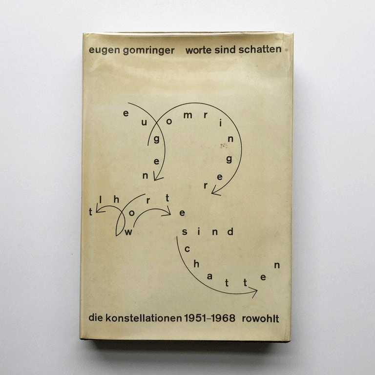
Eugen Gomringer (1925–2025) was a Bolivian-born Swiss poet and art theorist. He is often called the founder of concrete poetry. In 1953, he published a book that used the term konkrete Poesie (concrete poetry). He created short poems that he called “constellations.” In these works, ordinary words were arranged carefully on the page. The spacing, repetition, and placement of the words created meaning. In 1960, he wrote a manifesto titled vom vers zur konstellation (“from verse to constellation”), where he argued that a poem should be a “visual and functional object.” This meant that a poem should work like a designed object, not just like a paragraph of text. His minimalist poems, such as Schweigen (“Silence”) and Ping pong, became widely studied in schools.
At the same time in Brazil, Augusto de Campos and his colleagues were developing similar ideas. In 1952, he, his brother Haroldo de Campos, and Décio Pignatari founded the Noigandres group. In 1956, they held an important exhibition at the São Paulo Museum of Modern Art that showed poetry arranged visually rather than in traditional lines. Their 1958 manifesto, Plano-piloto para poesia concreta (“Pilot Plan for Concrete Poetry”), described poetry as “verbivocovisual.” This word combines three ideas: verbal (words), vocal (sound), and visual (sight). They believed that poetry should combine meaning, sound, and visual design into one unified art form.
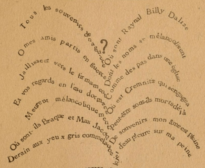
Concrete poetry also had earlier influences. One important predecessor was Guillaume Apollinaire, a French poet who lived from 1880 to 1918.


Apollinaire created poems called calligrams, which arranged words into shapes that matched the subject of the poem. For example, a poem about rain might be shaped like falling drops. His 1918 book Calligrammes combined text and image in ways that clearly influenced later concrete poets. Although he lived decades earlier, his experiments helped prepare the way for the concrete poetry movement.
In concrete poetry, the page is not just a blank space where words sit. Instead, it is treated as a visual field. Typography (the style of printed letters), spacing, repetition, and arrangement all create meaning. Words act like visual objects. Many concrete poems are short and do not tell a story. Instead, they use patterns and design to communicate ideas. In this kind of poetry, form (how the poem looks) and content (what the poem says) are closely connected. Sometimes the poem does not just describe something—it actually becomes a visual version of that thing.
Over time, some poets began combining concrete poetry’s visual style with the strict rules of traditional formal poetry. This approach is sometimes called “concrete formalist poetry.” It is not an official historical movement like Concrete Poetry, but rather a descriptive term. It helps explain poetry that blends visual design with strong formal rules.
Formalist poetry usually follows clear patterns such as meter (a steady rhythm), rhyme schemes, or fixed structures like sonnets or villanelles. Concrete formalist poetry keeps this sense of structure while also shaping the poem visually on the page. For example, a poem might form a visible square while also following a strict syllable count. In this way, visual creativity works together with rule-based discipline.
One example of this approach is sometimes called the “box” form. In this form, every line has exactly the same number of characters. When written in a fixed-width typeface—such as on a traditional typewriter—each line ends at the same point. This creates straight edges on both sides of the poem, forming a block or box shape. Even if the poem is divided into stanzas, each section keeps the same character count. The result is both visual and mathematical.
Historically, typewriters such as the Underwood were often used for this kind of work. Because each letter took up the same amount of space, poets could control alignment exactly. Double acrostics—poems in which certain vertical letters spell out words—could be arranged neatly in straight columns. This shows that even free verse has form, but the box form makes structure especially visible.
Concrete poetry has also been combined with painting and visual art. Over time, it became flexible enough to express many different tones and subjects. Concrete formalist poetry builds on that flexibility while adding strict structural limits. The term “concrete formalist poetry” makes sense because the poetry is concrete (it emphasizes visual design) and formalist (it follows clear rules).
The main difference between concrete poetry and concrete formalist poetry is how they treat structure. Concrete poetry often avoids traditional rhyme and meter and lets visual arrangement guide the poem. Concrete formalist poetry, however, combines visual design with strong rule-based systems. The page is still treated as a visual field, but it is also shaped by careful architectural limits.
In simple terms, concrete poetry experiments with space and design, sometimes breaking away from traditional rules. Concrete formalist poetry brings those rules back into the experiment. It joins visual creativity with disciplined structure. Because of this, it can be understood as more architectural—like building a carefully designed structure—while still remaining artistic and expressive.


Leave a comment